

The design tips I wish I knew before
Here's how I redesigned this Substack, my website, and everything else. It'll save you so much time, cost, hassle and pain. As do brand guidelines...

What you will get from this post:
Some insight into how I approach design and how I get inspiration
The tools I use to do this stuff quickly, painlessly, and free of charge
Things you must do if you are a stickler for detail like me
I’ve always had a keen eye for design.
Those who know me will know that I collect trainers. Those who know me well will know that I collect trainers because I see them as wearable art.
Design inspires me. Whilst I’m no expert, I take my inspiration from stunning architecture, I get wowed by tech with a striking look, and I get geekily obsessed with small things like fonts and colours.
Basically, I like things to be 💯. Or whatever emoji is now the socially acceptable one to convey ‘spot on’.
In the past I’d engaged web designers to create my personal website, but there was a nagging feeling. It wasn’t right. And frankly, that would’ve been down to my guidance. My tastes have changed, fashions have changed, and we move.
I last redesigned my personal website about three years ago. And I went bold.
Whereas many ‘personal brand’ sites have bright yellow or orange text, striking colour clashes, and so on; I took inspiration from the colours I wear and a feeling. I know I stand out and look a little rough around the edges, and needed a colour scheme that is congruent with who I am. Almost military, I guess. Although you don’t get many in the military with face tattoos.
Since then, I have changed a lot. Weight loss means I’m nearly half the man I was before. But, the design just needs a tidy up. I liked it. I didn’t love it.
So, the redesign is happening. It’s a work in progress. And it’s easier than ever.
I stumbled across an Instagram reel from @fatummusic which shared some amazing tools. He took pleasure in saying, quite rightly, that he wouldn’t gatekeep this information.
I won’t gatekeeper either.
I’m doing this redesign myself. As I said before, I’m no designer. So I had a little help from these tools and services. Here are my thoughts, at the point of writing:
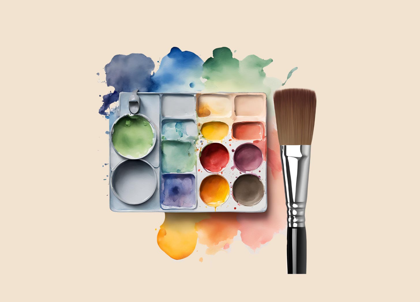
INSPIRATION
Liberty / Selfridges / Harrods - ridiculous but true. I look at all sorts of products to spot trends in design and fashion - colours, typefaces, materials used. It helps me to get a feel for what works.
Brandsite.design - a fascinating repository of brand guidelines from brands we know and (possibly) love.
Behance - again, a home of design to sniff around and see what floats your boat. Also, Instagram is great for this!
COLOUR SCHEMES
House of Colour - I had a colours consultation with the wonderful Kelly at House of Colour, as part of my preparation for keynoting at their annual conference. Whilst this might not be a step that you want or need to take, it helped confirm my gut feel of what colours work for me when I wear them. The differences between a good colour and a bad colour are staggering. A bad colour can make you look washed out and unwell. A good colour? Wow! As my image is on my online content, it seemed to be natural to take guidance from this process.
Digital Colour Meter - this is an app on your Mac. I believe there are similar tools within all design software, including Adobe and Canva. It allows you to select a colour on your screen and gives you the hex code. I don’t know if there’s a standalone PC equivalent. You may also need to use a colour code converter to convert an RGB output into a HEX code. It’s much simpler than it sounds, I promise! My core colour was the beige background, and I wanted to maintain that.
coolors - this is a colour palette generator which shortcuts the process of finding a complementary colour palette. And it’s so simple to use. It provides the colour codes, and saves the agonising process that I went through before to try and find colours that just worked using HEX codes and colour picker tools. If you use this tool, it also has a colour code converter.
Using my base colour that I already knew from my previous website and reaffirmed from my colour consultation, I used the above tools to generate this colour palette. I wanted 3 ‘stand out’ colours and 3 ‘muted’ colours to work with going forwards.
Here’s my results. I’ll likely tinker with these once I crack on with content creation - either as a formal refresh or as a tweak if things just don’t hit right when I start using them, but I’m happy that they can work for the time being.
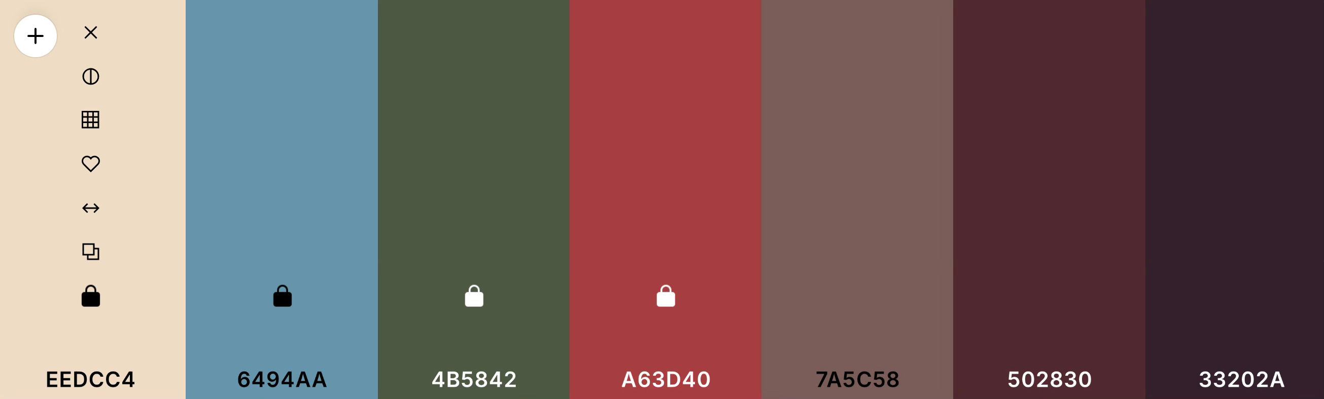
Funnily enough, as I type this, I notice a slight difference between my ‘base’ colour - the current background on my Substack - and the palette. That will be changed as I know the colour I want for the background.
This whole process to build the palette took about 10 minutes, and with the exception of the consultation, is free of charge.
DESIGN
Canva - if you don’t know Canva, get to know. We use Adobe within the dt group, as I can’t get the words ‘don’t take investment advice from a man with artwork made on Canva’ out of my head. I’ve no idea who the MC who rapped that was, but it rang true! However, for my personal purposes, I don’t have to spend the p’s… it works. I use it for social posts, AI imagery, all sorts.
Wix - for the website build, I used Wix Premium when it was first designed. If I’m honest, I’m only sticking with it as I’m in the second three year prepaid subscription. I believe there are better solutions, but for now it’s great for making quick and dirty edits when needed, and even an amateur like me can make it work.
You’ll see that there is one notable omission. I’ve not talked about fonts. How to choose them, how to use them. There’s a couple of reasons for that.
Firstly, there are a number of limitations within online tools. My hands are tied whilst using Substack, Canva, Wix and so on. I have no issue with using stock fonts as I have no wish to design everything on a bespoke basis. I need to find fonts that work across the board and consistently.
And secondly, I want to get some content going. As I create it, I’ll see it, and I’ll feel it. Most of this stuff is gut feel. And, the font is probably one of the bigger changes. Given that it’ll likely also be driven by at least one of the aforementioned off the shelf tools, it feels like a conbination of both the most and least important choice.
What I do know however is that I’ll be using a serif typeface for my words, and a bold (likely sans serif but not definitely) for my callout headlines on socials.
What next?
Once I’ve played around with all this stuff, tweaked it (and yes there will be countless nights of tweaking I’m sure!) and tested it pre launch, I’ll draft myself some brand guidelines.
I’ll then double check that everything cross checks and is consistent.
This might sound ridiculous for a pet project, but, I’m not going to any crazy levels with this. Although, I’m a self confessed tinkerer (if that’s a word)! I love playing with stuff and seeing if I can tweak it and make it look just a little better.
One thing is for sure. I’m going to make sure I write down the fonts, write down the colour codes, and use them consistently.
That’s it. The bare minimum I need for brand guidelines.
If you’ve got a business or have anyone else creating anything that represents you online or offline, doing this is even more important. And you need to include so much more to make sure that you communicate in the right way, at the right time, every time. At the dt group, our green was referred to by a former team member as ‘sh*tty green’. And he had a point. It was awful for legibility, and a little jarring. We’ve been lumbered with it for some time, we’re gonna deprecate it at some point, but still - it’s in the brand guidelines.
Why?
Simple.
Because ‘sh*tty green’ is a really bad brief for a designer or a printer.
Carl Reader is a WH Smith Bestselling Author and international keynote speaker with a real passion for helping people do better. There are two ways to learn more about Carl! You can either follow him on Social Media if you’re just curious (@carlreader on most platforms), or if you’d like to learn a little more about what he does on stage, through content and in the media from a commercial perspective, you can visit his website.
You can buy a copy of his last book BOSS IT here, wherever you are in the world. And of course, I’d love you to subscribe to this community to be the first to see everything I have to share - just click the button below. It’s free of charge!
Subscribed
There’s an important disclaimer which applies to all content shared on this Substack, available at the bottom of this page, together with the statutory information that is required to be shared under current UK legislation.